ux

Disabling Autocomplete on forms in Drupal 6 or 7 - Forms API

With the awesome new #states implementation in Drupal 7, and for form usability in general, it's often good to be able to selectively, or completely, disable form autocompletion for your users. One example I just encountered was a form that has two fields that are alternatively shown or hidden depending on the value of a checkbox earlier in the form. However, Google Chrome, in its infinite wisdom, was autofilling the hidden field, which shouldn't have a value if hidden, so I had to set the input's 'autocomplete' value to 'off.'

For simple textfields, here's how you could do that in a hook_form_alter() (in this example, I was disabling autocomplete on the user registration form's email field):
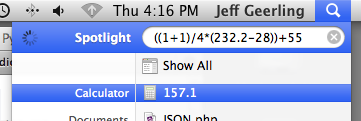
Who needs a Calculator? Spotlight is better.

When I'm performing quick calculations or estimates, measuring things, or balancing my checkbook, I just hit Command + Spacebar, then type in what I need to know.

Spotlight Math

  • 1+1? (Spotlight gives the answer right away: 2)
  • ((1+1)/4*(232.2-28))+55? (Spotlight gives the answer right away: 157.1

Instant math... way better than any calculator or calculator app I've ever used... and it's always at my fingertips.

Bonus: press Command + C to copy the result to the clipboard. Awesome.

Best Practices and Tips for In-App iPhone or iPod Touch UIWebView Browsers

Or... "Best Practices of In-App Web Browsers"

Being the usability nut that I am, I have decided that my goal of making a perfect in-app browser for various iPhone apps is an impossible task. But, judging from what I've been able to do so far, and from many different Web View examples I've seen from around the web, there are some basics that every in-app browser should get right.

I'll start by showing the in-app browser in two very well-known iPhone apps: Facebook and Twitter.


Facebook's Browser

Twitter's Browser

Fundamentally, and functionally, these two in-app browsers are the same. And, after looking at maybe a few hundred other browsers, It seems like the list of essential features of a usable in-app browser are:

Users Are Stupid - a Guiding UX Principle

About a week ago, a road near my condo was closed off due to construction. Prominent signs were placed at three separate junctions warning drivers to take a detour. Judging by these signs, a rational individual would get the hint and turn right, avoiding any unnecessary danger to his life or his vehicle.

Unfortunately, users (and drivers) are NOT rational when it comes to most decisions. They have a goal, and they'll do whatever they think is best to achieve that goal, whether or not it's allowed, legal, and/or rational.

Case in point: I sat outside and watched car after car go completely around not one, but three glaringly obvious barriers to avoid a two minute detour.

Here's the first warning, at the first intersection:

Road Sign #1: Road Closed
Pretty obvious, eh? Would you drive around this sign?

And, after that gauntlet (5 different signs saying "DON'T DO THIS!"), here's the second warning: