About a week ago, a road near my condo was closed off due to construction. Prominent signs were placed at three separate junctions warning drivers to take a detour. Judging by these signs, a rational individual would get the hint and turn right, avoiding any unnecessary danger to his life or his vehicle.
Unfortunately, users (and drivers) are NOT rational when it comes to most decisions. They have a goal, and they'll do whatever they think is best to achieve that goal, whether or not it's allowed, legal, and/or rational.
Case in point: I sat outside and watched car after car go completely around not one, but three glaringly obvious barriers to avoid a two minute detour.
Here's the first warning, at the first intersection:

Pretty obvious, eh? Would you drive around this sign?
And, after that gauntlet (5 different signs saying "DON'T DO THIS!"), here's the second warning:

See that in the distance? Pretty obvious there's no way through...
Finally, if someone is crazy enough to intentionally go around both of those barriers, there's a third and final barrier, which is the point of no return:

See that car coming? There's no way for two cars to get through. Thus the road's closed.
What does this mean for web developers? Quite a bit.
Users are Goal-Oriented (read: Stupid)
By stupid, I don't mean your users are literally dumb. I mean they are stupid/dumb to doing anything besides what they think will get them to their final destination in the quickest way possible. Whether that be driving around barricades, clicking in unorthodox places, or cheating through high school.
People always take a short bit of time to weigh their risks against the benefits of taking a shortcut, and they'll typically do whatever they judge is fastest, as long as it doesn't get them killed. This can mean disaster on a website.
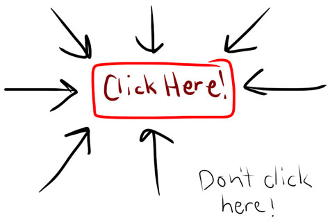
Where do you think users will click? Hint: Some will probably give up.
Ignoring my inability to draw on Art Studio for my iPad (see above), most web design projects I've been involved with have had certain pages/areas that look very much like the above graphic. And, you know what? I invariably receive an email at some point saying "I clicked where it says don't click here, and something I didn't want to happen happened."
Typically, I won't have something on the site visible to end users or content managers that could damage anything major; however, there's always something that can cause irrevocable damage, and users have a penchant for finding that something.
Counteract Users' Stupidity
Since users are oriented toward their goal, you need to account for it. They will not always do what you want them to do—you need to have an out. In many phone systems, regardless of how the menus are set up (don't get me started on the ridiculous voice-guided prompts), the best systems are the ones that, after a user repeatedly presses '0,' finally give the caller to an operator.
Follow conventions like this, and users won't get angry and do stupid things. Also, don't make a user feel like he has to do something wrong to accomplish his task. On one of my sites, a user was going through four different pages to find a configuration link for his menus. After he became quite bitter about this complicated process (but never told me about it), I finally noticed what he was doing, and showed a way for him to get to the menu in two clicks.
Offer Alternative Ways to do the Same Thing
While you shouldn't make things overcomplicated, or offer too many avenues for people to do the same thing, it's never a bad idea to offer two or three ways to do the exact same procedure.
For example, while I'm editing text in a WYSIWYG, I like using Command-C to copy text. Some people like right-clicking and selecting 'Copy' from a contextual menu. Others might select text, then click on the 'Edit' menu and click 'Copy.' None of these processes are wrong, but if you take away one, a subset of your users are going to get angry and do irrational things to accomplish their goal.
Further Reading
For further study of user interaction on the web, in particular, I highly recommend Steve Krug's Don't Make Me Think! A Common Sense Approach to Web Usability, a book focused on website usability.
Some websites I follow pretty closely for UX issues: