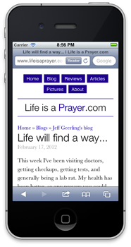
For the first time ever, I decided to make one of my personal sites look good on mobile phones by incorporating 'responsive' design. Basically, I use some spiffy CSS to say "when you're viewing Life is a Prayer.com on an iPhone, or Android phone, or a window smaller than x pixels, change the layout of the site so it's a LOT easier to read.
So, if you have a mobile phone that runs iOS or Android, whip it out really quick, head over to Life is a Prayer.com, and tell me what you think (even the comment form works great now!).
If you don't have a smartphone, but you use a modern web browser, try making the browser skinnier until you see how the content on the site re-flows (and images resize) so they fit the window a bit nicer!
I'll be blogging more about responsive design and how easy it is to get a design 90% of the way there over on my Midwestern Mac blog, but I just wanted to post this here for historical relevance and to give people an example of a responsive design that doesn't make the website unusable or radically different.
Comments
Hi, looks great to me. You've dealt with an issue I'm struggling with: my new iphone 4S shows nicely readable text, with a similar size text to that on the old iphone which had lower resolution, so it looks the same as the "320" diameter display on this testing tool. http://www.studiopress.com/responsive/
We're working with responsive design but often have trouble where test and images look much smaller on these small screen, high res devices. Interested how you address this issue? Thanks
You just need to set the image size as a percentage of the width, with auto height, or set images with a 'max-width' and auto height, and then images will expand or contract to fit accordingly.