For a few of my smaller sites (like my portfolio website, www.jeffgeerling.com), I've had a little todo item on my list for the past year or so to make the them 'more responsive'—mostly meaning "make it legible on an iPhone or comparable Android phone". Most tablets I've used render traditional 960px layouts appreciably well, including the iPad, Kindle Fire, Samsung Galaxy Tab, etc., so I want to just focus on making the websites usable on smartphones.
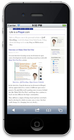
What we had, and what we're going for (which one seems more readable and user-friendly on a small screen?):

I'll show you how I quickly (in less than half an hour) added a <meta> tag to the site's <head> tag to instruct mobile phones on the width of my site, and how I added a simple @media query to my theme's stylesheet to apply a few layout rules to make the design of the site better for mobile phones.
Outline:
- Getting your head straight – setting up the proper meta tag
- Responsive styles – adding a @media query to your CSS
- Breakpoints, Mobile First, etc. – further thoughts and links
Getting your head straight
The first step in making a design responsive is to add the viewport meta tag to all your pages, instructing mobile phones of the 'initial-scale' and 'width' settings you'll be using for mobile layouts. It's relatively simple to do this in Drupal, just go to your theme's template.php file and implement hook_page_alter() like so (replace THEMENAME with your theme's machine name):
<?php
/**
 * Implements hook_page_alter().
 */
function THEMENAME_page_alter($page) {
  // Add meta tag for viewport, for easier responsive theme design.
  $viewport = array(
    '#type' => 'html_tag',
    '#tag' => 'meta',
    '#attributes' => array(
      'name' => 'viewport',
      'content' => 'width=device-width, initial-scale=1',
    ),
  );
  drupal_add_html_head($viewport, 'viewport');
}
?>
Note that I have not set a value for 'maximum-scale', which limits a smartphone user's ability to zoom in on the web page. I don't recommend setting this to '1' as many do, because there are still situations when you want to let your users zoom in further, even if text is laid out well and legible; say you have photos people want to zoom into to see more detail, or an elderly user who wants to zoom in on your text even further; best to let users decided for themselves if they want to zoom, in my opinion.
- Setting 'width=device-width' tells the device to use the native screen with (say, 320px for an iPhone in portrait view) instead of a virtual device width (960px, usually).
- Setting 'initial-scale=1' tells the device to zoom in to the first (normal) zoom level (which is almost always desirable).
Now that you have the viewport set up correctly in your <head>, you can start working on making the design look good at different resolutions!
Responsive Styles
Note that I'm going for simple here, and I'm not going to outline all the steps and design work that goes into making a full-fledged, 100% responsive design for a large variety of screen resolutions and widths. Instead, I'm focusing on simply making a design look good for average desktop sizes (~960px), and smartphones (both large and small—680px or smaller).
The first step towards making your design responsive is simply changing a little bit of the layout of the main parts of your design. In my case, that meant making the page container 100% (fluid width) instead of 960px (fixed width), un-floating the main content area and sidebar (so the sidebar would appear below the main content), and adjusting a few section-specific styles to make sure everything looked uniform (especially with regard to bottom margins).
I'll leave out some of the nitty-gritty details, but the basic rules you need are an @media declaration (with a 'max-width' declaration to tell browsers how narrow the viewport should be before applying the rules within the @media declaration), and then some CSS to change the design. The basic reflow happens with the below code for http://www.jeffgeerling.com/ :
@media screen and (max-width: 680px) {
  #page-wrapper {
    width: 100%;
  }

  #content,
  .sidebar-first #content,
  .sidebar-second #content {
    float: none;
    width: 100%;
  }

  #sidebar-first,
  #sidebar-second {
    float: none;
    width: 100%;
    margin: 1em 0;
  }

  img {
    max-width: 300px; /* Make sure all images fit within viewport */
    height: auto; /* Correct width from max-width rule above. */
  }
}
This simple change made the width of the page the width of the device, and positioned all the content on top of each other, with the same device width, for easier reading, and a much nicer flow on a narrow screen. (See images at top of post to compare before/after!).
Note also the <img /> tag rules I added at the bottom. I did this so that images I place on my blog and in articles don't show at a larger width than 300px; I typically size images to ~500px wide for my blog, and if I displayed them the same on a mobile device, the user would need to side-scroll to view the entire image. Since I let users zoom, users still see the image at full resolution—they just need to zoom in a little on the picture to do so. Definitely not a major tradeoff, imo, and the layout looks nicer without huge images everywhere.
Breakpoints, Mobile-First, etc.
Since this article was a very basic introduction to getting one's Drupal theme up and running with a responsive layout, and not a full treatment of responsive design principles, I've left out a lot of implementation details and philosophy. Here are a few brief notes about things you should keep in mind as you explore responsive design further:
- You can put @media query rules into separate stylesheets (and, in most cases, you probably should), and include them using Drupal's normal stylesheet inclusion methods (like
drupal_add_css()or via the .info file (see this article for more details)). - You may notice I used the breakpoint of 680px, and not a 'traditional' breakpoint of 480px or 320px (the two dimensions of the iPhone screen). The reason for this is that I believe 680px is a better point at which my particular site's layout can switch from a fixed to a fluid layout; anything larger, and I'll just let people scroll over to see the (minimal) sidebar content. Anything smaller, and it's fluid. At DrupalCon Denver 2012, many designers mentioned the idea—which I fully support—of letting your site's content dictate your responsive layout breakpoints, instead of setting breakpoints at 'traditional' screen sizes (like 320px, 480px, 1024px, etc...). More good reading here.
- Some in the design community are proposing we begin developing websites for 'mobile first' (great presentation on this very topic by LukeW). This will force us to focus on what matters on a website, and only add in resources and non-essential content when displaying the site on larger screens (and on devices that typically have fewer bandwidth/processing limitations). I do agree with this idea to a point, but I'm still developing most sites for desktop first (with default styling and content maximized to a ~960px width) for a couple reasons: First, it's always hard to change my ways, and second, IE 9 and lower don't work with @media queries at all... meaning you have to add in more JS to try to knock those browsers into submission :( — this stuff will change over time, and for some projects, I do think I'll start at least thinking mobile first, if not designing mobile first.
Comments
Ironically, this site's theme isn't responsive at all. But I may open an issue in the queue for MM and ask the maintainer (I know him well ;-) to make it so!
Thanks,
I found this really useful. I have been searching for ages for an article like this!
Great job!
Do I add the css code to the main.css or create another .css file with the above code?
5 years later and this was extremely simple to understand and implement. thank you!!