Users Are Stupid - a Guiding UX Principle
About a week ago, a road near my condo was closed off due to construction. Prominent signs were placed at three separate junctions warning drivers to take a detour. Judging by these signs, a rational individual would get the hint and turn right, avoiding any unnecessary danger to his life or his vehicle.
Unfortunately, users (and drivers) are NOT rational when it comes to most decisions. They have a goal, and they'll do whatever they think is best to achieve that goal, whether or not it's allowed, legal, and/or rational.
Case in point: I sat outside and watched car after car go completely around not one, but three glaringly obvious barriers to avoid a two minute detour.
Here's the first warning, at the first intersection:
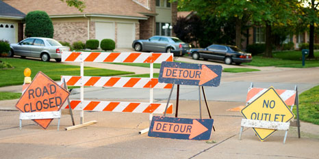
Pretty obvious, eh? Would you drive around this sign?
And, after that gauntlet (5 different signs saying "DON'T DO THIS!"), here's the second warning: