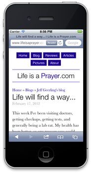
Life is a Prayer - Looking great on your smartphone!
This post is more than 10 years old. I do not delete posts, because even old information is still useful, but please know that some material on this page may be outdated or incorrect. Thanks!
For the first time ever, I decided to make one of my personal sites look good on mobile phones by incorporating 'responsive' design. Basically, I use some spiffy CSS to say "when you're viewing Life is a Prayer.com on an iPhone, or Android phone, or a window smaller than x pixels, change the layout of the site so it's a LOT easier to read.
So, if you have a mobile phone that runs iOS or Android, whip it out really quick, head over to Life is a Prayer.com, and tell me what you think (even the comment form works great now!).
If you don't have a smartphone, but you use a modern web browser, try making the browser skinnier until you see how the content on the site re-flows (and images resize) so they fit the window a bit nicer!
I'll be blogging more about responsive design and how easy it is to get a design 90% of the way there over on my Midwestern Mac blog, but I just wanted to post this here for historical relevance and to give people an example of a responsive design that doesn't make the website unusable or radically different.
Comments